Skip to the good bit
ToggleSome rooms feel peaceful the moment you walk in. Others feel busy and full of life. Both can look really good. The difference is not luck. It comes down to one simple choice made early on and then followed through properly.
These two styles are called minimal and maximal. They are not just about how much stuff is in a room. They are about how that stuff works together. Understanding both will help you decorate any room with more confidence.
Minimal Does Not Mean Empty
This is the mistake most people make. They remove almost everything and then wonder why the room feels sad and cold instead of clean and calm.
A minimal room still has decorative items and wall decor. It just has fewer of them. And because there are fewer, each item has to be really good on its own. Think of it this way. If only two things are sitting on a shelf, both of those things are going to get a lot of attention. They cannot hide behind other objects. They have to look great standing alone.
Choosing what to keep is the hardest part of minimal styling. It is not about buying less. It is about being honest about what actually looks strong on its own. Some items only look good when surrounded by other things. Those items do not belong in a minimal room.
Sentimental value does not count here either. Something can mean a lot to you personally and still not be the right fit for a minimal shelf. The question to ask is simple. Does this item hold its own when nothing else is around it?
Space Around Things Matters More Than You Think
Here is something easy to test at home. Place any small decorative object on a shelf full of other things. Then, clear the shelf and place just that one object in the middle with open space on both sides. It looks more valuable and more deliberate in the second situation. Nothing about the object changed. The space around it did all the work.
This is not a styling trick. It is just how our eyes work. When there is less around something, we look at it more carefully. Minimal rooms use this to their advantage.
The same thing applies to walls. One framed picture on a plain wall feels as if it were chosen with purpose. That same picture, surrounded by five other frames, becomes just one part of a group. Both approaches can work well, but they feel very different from each other.
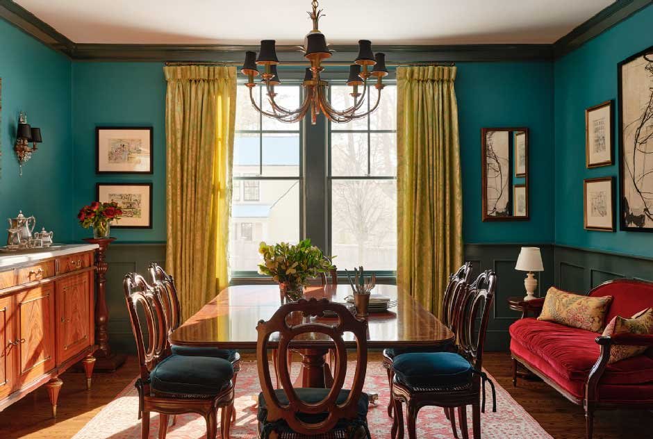
Maximal Styling Is Not Just Clutter
A lot of people think “maximal” means “messy”. It does not. A well-done maximal room has a lot of things in it, but those things are connected. There is a logic to all of it, even if you cannot immediately explain what that logic is.
Usually, the connection is colour. The shades in the wall decor reappear in the objects on the shelves. The textures repeat in different parts of the room. Everything feels like it belongs together, even though the pieces may have come from very different places.
Without that connection, a full room just looks like a pile of things. That is the difference between a maximal room that works and one that does not.
Maximal styling is actually harder to get right than minimal. In a minimal room, one wrong item is easy to spot and easy to remove. In a maximal room, one wrong item blends in and quietly makes everything feel slightly off without you knowing why.
Where Both Styles Go Wrong
Minimal rooms go wrong when people think pale colours are enough. A room with white walls, beige shelves and light wood floors is not minimal. It is just dull. Minimal styling still needs a few items with a strong visual presence. Just not many of them.
Maximal rooms go wrong when things keep coming in, and nothing ever leaves. Over time, the room gets heavier. The pieces you actually love get lost behind everything else. Good maximal styling needs regular editing, just like minimal does.
What This Means for Wall Decor
In a minimal room, one large piece of wall decor works better than several small ones grouped together. It gives the wall a clear and settled feeling without pulling the eye in too many directions.
In a maximal room, gallery walls are a great fit. Mixing framed art with shelves and other wall objects suits this style naturally. The one thing that holds it all together is colour. When the colours across the wall stay consistent, the whole thing looks planned. When they do not, it ends up looking like different decorating decisions that just happened to land on the same wall.
Rooms that feel uncomfortable are usually pulled in both directions without fully committing to one. The answer is rarely a new purchase. It is simply deciding what the room is supposed to feel like and then being willing to remove whatever does not support that.