Skip to the good bit
ToggleDo you realize that 94% of the feedback on a site is regarding design where 6% is related to the content? Yes and this reveals one simple fact. The appearance of your site is more important than the words you write on the webpage. The digital age places a lot of value on first impressions. It is because visitors make up their minds in a few seconds on whether to remain on your website or not. This is where the mobile-first and responsive design argument falls in. Most companies hire custom web development services but then become confused between choosing responsive and mobile-first design. But, it is a critical decision to make, as it may influence user experience, engagement, and even sales. A mobile-first approach is usually a good place to start small, but it can be a competitive advantage. Meanwhile, responsive design is a sure way to make your site look good on all screens. However, it can be more difficult when you are starting on the wrong foot. In this guide, we will explain everything about mobile-first and responsive design. Then you will find out why starting with small screens can make your business site more useful. It will help you design a layout that visitors will actually be interested in.
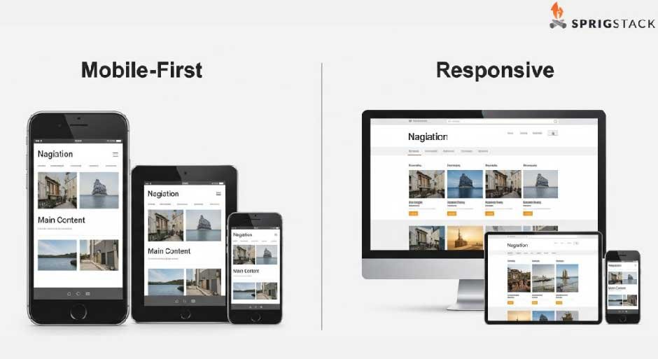
What Is Mobile-first Web Design?
Mobile-first design is an advanced strategy that creates websites that are mobile-first. It is fast, straightforward and user-friendly on small screens. Also, it does not make the user keep clicking; it makes the navigation easy and maintains the content flow. This will provide visitors with more rapid access to what they require, enhancing interaction and the end-user experience across devices.
What Is Responsive Web Design?
Responsive web design refers to creating sites that work well on any device, be it a mobile device, tablet, or desktop. The layout and content are automatically adjusted, instead of having to build separate versions. This offers standardized usability, readability and design between devices. Responsive design allows a business to provide a smooth experience and retain its users regardless of how and where they browse.
Difference Between Responsive and Mobile-first Web Design
Well, both a mobile-first or responsive design and a human centered design approach enhance user experience, but they work in different ways. So, knowing their major differences will assist you in choosing the correct strategy to use on your business site..
Starting Point
Mobile-first design uses the smallest screen but puts the most relevant features first. The approach of responsive design, on the other hand, takes desktop designs and sizes them down. Knowing this starting point matters as this shapes the user experience, leading to effortless navigation on all devices.
User Experience
Mobile-first design provides mobile users with faster load times and easier navigation, which is critical because most traffic is phone-based. Responsive design is flexible, but it might get cumbersome and overwhelming when reduced to desktops.
Content Priority
With a mobile-first design, viewers can only see the most significant content, which is noticeable and brief. But responsive design modifies the layouts. But, in most cases, it often includes the whole content, making it harder for end users to navigate and understand it.
Performance
Mobile-first design enhances performance by reducing redundant features. It also provides quick speeds with low network speed. But, responsive design responds to devices, but it might contain a large amount of code or images that will slow loading time and satisfaction time.
Pros and Cons of Mobile-first Web Design
When a website’s primary audience uses their mobile phones more, a mobile-first design is recommended. Therefore, custom web development services are the ideal choice to ensure the site is built correctly.It refers to developing the site on mobile, and then increasing it on big screens. Here are its pros and cons:
Pros:
- Clear readable information in a brief format.
- Exceptional with younger users who spend most of their time surfing on their smartphones.
- Basic code that enables the websites to load quicker.
- Custom mobile experience, which scales up well to desktop or tablet.
Cons:
- Takes more testing and work to perfect.
- Suppress creative design thinking.
- Not everything runs well as an animation or a plug-in.
Pros and Cons of Responsive Web Design
Responsive web design refers to the fact that the webpage will change to suit any screen size. The content varies in its shape and size according to the device. Here are its pros and cons:
Pros:
- Works well on all devices.
- Saves money because of not having to create separate designs.
- Helps improve SEO results.
Cons:
- It is not easy to make a single design look good everywhere.
- More time to construct or redesign.
- Loads slowly on phones provided the content or pictures are too many.
When to Choose Which One?
Whether to use mobile-first or responsive web design is a choice that will rely on your audience and objectives.
- A mobile-first strategy is best when the majority of your visitors are smartphone and tablet users. It is fast loaded, simplified and layout-focused. Mobile-first design is most suitable for e-commerce websites, apps or any other business with a strong mobile traffic.
- Responsive design, on the other hand, works well in situations where there is a combination of devices such as desktops among others. It enables your site to adapt itself to any screen size with a similar look and feel. Responsive design is well-suited to websites with heavy content, blogs, or businesses with a large percentage of desktop traffic.
The smart way to go is to go small, with mobile-first principles. Then go big with responsive methods. This will ensure your site works perfectly, looks beautiful and keeps visitors going on any device.
Conclusion
The decision to use mobile-first or responsive design defines the success of your website. Mobile first works quickly and is easy to use on mobiles, but responsive is universal. No matter what you pick, to achieve the desired result, hire custom web development services. It is because the best agency can design a site that not only appears attractive, but also loads quickly. It will then keep the visitor occupied throughout the site.